Purpose
The set of reports enable you to analyze fluoroscopy dose data using a variety of filters to obtain an overview of your systems’ performance and to delve into the details. Using the reports, you can identify outlier exams, highlight other patterns for further investigation and find missing data and gaps in data transmissions to the registry.
How to Access
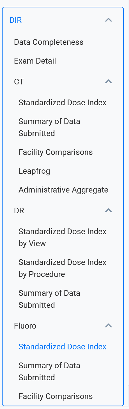
Log into the NRDR portal and select Fluoro Standardized Dose Index Reports to access the report’s tabs: Exam Search, Scatterplot, Boxplot by Scanner, Boxplot by Procedure, and Index Comparisons.
The About this Report tab provides insight into the reports’ measures and filter use. Upon selecting a tab, hover over the information icon (blue circle in the upper left corner) to obtain details about maximizing the report’s analysis capabilities.
Note: Please use the Feedback link in the top left corner of each tab to provide suggestions for improving the report or for new reports.
Report Features
Get started by selecting a Corporate Account, a corresponding Facility, or Facilities, and a timeframe of interest.
Exam Search Tab: This tool enables you to query procedures using a variety of criteria. The sample screenshot below shows results associated with all adult procedures across all stations for a 30-day period.

The individual exam data appear on the left side of the table, with Total Fluoro Time (min.), Cumulative Air Kerma (mGy) and Kerma-Area Product (Gy*cm^2) provided on the table's right side.
Also included in the table's right side are two derived indices: Average Reference Air Kerma Rate (mGy/min) and Average Field Size (cm^2). Reference Air Kerma Rate is an estimate of the exam’s average air kerma rate value, calculated by dividing the Cumulative Air Kerma by the Total Fluoro Time. Average Field Size is similarly calculated by dividing the Kerma-Area Product by the Cumulative Air Kerma.
The bar chart to the right of the table summarizes the distribution of exams by Study Type using either the mapped ACR Common procedure names or a facility’s internal clinical procedure names (Study Description or Procedure Description) populated in the DICOM header. Selecting a bar in the chart will filter the report by the procedure.
Note: Procedure mapping to a common lexicon, or standard terminology, is an ongoing process that enables analysis and comparison of imaging procedures named differently across DIR participating facilities. ACR Common is the common lexicon for the DIR Fluoro. Learn more about procedure mapping here.
Scatterplot: This feature helps you identify unusual patterns or outliers for DIR Fluoro dose indices. Use the report filters and parameters, e.g., Fluoroscopy Measure, Age Group, Body Area, and Study Type, to refine the data in the scatterplot. You also can hone in on facility performance by specific station and equipment manufacturer and model.
The following screenshot illustrates several components of the scatterplot.

The report plots the value of each Cumulate Air Kerma (mGY) measure for 508 procedures by date for a 30-day period. The Station Statistics table summarizes the number of observations and minimum, maximum, and median measure values with red highlighted text indicating the largest values within each column.
Hovering over a measure dot in the scatterplot provides exam details, and clicking a measure dot will add a link to the Index Comparisons report to view boxplots of all indices for all exams for that procedure.
Boxplot by Scanner: The filters allow you to assess dose index data between scanners for one or more facilities in a box-and-whisker format.
In the example below, hovering the cursor over the shaded “box” area displays the Kerma-Area Product quartile data for abdominal procedures over a 30-day period with the black horizontal “whisker” lines denoting the cutoff for statistical outliers. Hovering over a single measure dot shows procedure details.

Note: Changing the Station Detail parameter from Device to Model may provide a more useful comparison by aggregating data to the model level, as different stations may require different dose levels to obtain the same quality diagnostic image.
Boxplot by Procedure: The filters allow you to analyze dose indices by procedure for one or more facilities in a box-and-whisker format. In the example below, hovering the cursor over the shaded “box” area for Biliary displays the Kerma-Area Pro quartile data for abdominal procedures over a 30-day period with the black horizontal “whisker” lines denoting the cutoff for statistical outliers. Hovering over a single measure dot shows procedure details.

Index Comparisons: The screenshot below illustrates how charts of the dose indices can help to identify outliers across dose indices. Select one or two procedures at a time for the best report view.

Click on the image for a better view.