Report Purpose
The CT Administrative Aggregate Report enables users to analyze performance and drive improvement in CT imaging. The report provides insights about:
How a facility's performance compares with the entire registry and with various peer groups, e.g., facility category, location type, and census division
Establishing site-specific radiation dose targets
Opportunities for performance improvement
Performance results after implementing changes.
The report is specially formatted for viewing and downloading aggregated dose performance data for further analysis and report sharing.
The DIR CT Administrative Aggregate Report released in December 2023 combines and replaces the CT Corporate Excel Report and CT Facility Excel Report plus adds new filters and functionality. View the video to learn what's new. For information about other DIR CT report updates see the DIR CT Report Changes article. View the 14:31 minute video to learn about navigating the report and its features.
How to Access - Log into the NRDR portal.
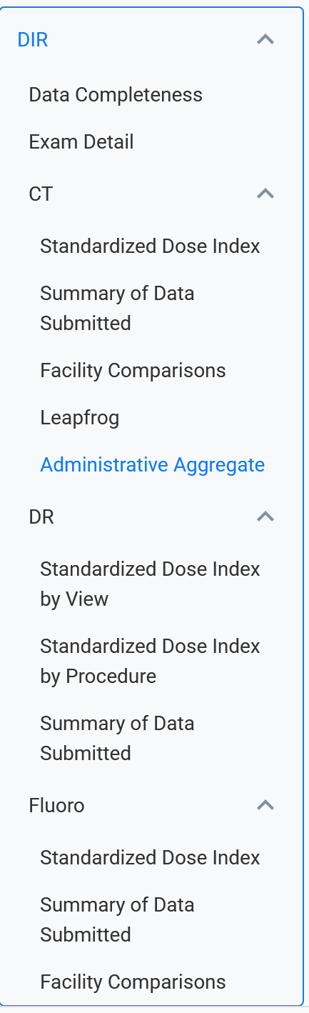
From the Reports page, under DIR, select CT Administrative Aggregate.
Report Help Features
The report is divided into five tabs called dashboards across the top of the report. The About this Report dashboard provides a brief description of each dashboard, information about the measures and inclusion criteria, and a few pointers for navigating across the dashboards. In each dashboard, hover your pointer over the information icon (blue circle) in the upper left corner for a brief description of the dashboard's purpose and how to populate it with data. Once the report is populated with data, click the Help link to bring up an overlay with specific report navigation instructions. The Read about this report link opens this Knowledge Base article and the Feedback link opens a user input form.
Dashboard Features
Aggregate Comparisons Dashboard:
Highlights dose index outliers aggregated by either the Exam Short Name or Body Area level using the Exam Aggregate Level filter and enables comparison of one or more facilities to the registry and a selected Peer Group such as location type or facility category. The date From-To filter enables targeting specific periods, for example, to observe how a protocol change affected dose performance. The Statistics filter and Comparison Standing filter allow you to select performance parameters of most interest. Facility median dose index performance is compared to the registry and reflected in the DIR Standing column. Percentiles reflect the proportion of facilities with median values falling below the specified value. For example:
25th Percentile: 25 percent of facilities have a median dose index falling below this value.
Median: 50 percent of facilities have a median dose index falling below this value.
75th Percentile: 75 percent of facilities have a median dose index falling below this value.

The screenshot example of the Aggregate Comparison Dashboard below shows the dose index CTDIvol results for adult Chest-Abdomen-Pelvis exams have a comparison standing above the 75th percentile compared to the registry and to the selected peer group.

Note: View the Creating a Custom View video to learn how to save a set of filter values for future use so that you don't have to set up filters each time you log in to view the report.
Trend Data Dashboard:
Allows for viewing the performance of one or more facilities over time using the Time Periods filter to select a Semiannual, Quarterly, or Monthly view option. The report provides performance data for one or more facilities in a downloadable format so that users can create trend charts.

Short Name Lookups Dashboard:
Shows how a facility's exams map to Radlex Playbook IDs (RPIDs) and the report's Exam Short Names. Using this report helps identify mapping inconsistencies across facilities.

Registry Statistics Dashboard:
Shows the registry exam count, the number of facilities, and percentiles for every exam name/age group combination. The report can provide insight into the dose indices performance that a facility may want to target when considering performing a new exam.
