Purpose
This interactive report allows you to review your facility’s dose index statistics and compare them with data from all DIR DR participation sites. Multiple dashboards are available to benchmark your facility performance against the registry using scatter plots and box-and-whisker plots. Within an institution, comparisons can also be made across different DR manufacturers and user-defined station groups. These visualization tools help identify problematic DR exams, facilities or stations that may benefit from targeted quality improvement efforts.
This report includes all submitted studies mapped to an ACR Common ID. Dose statistics are reported by ACR Common ID.
How to Access
From the DIR directory page in the NRDR portal, select DR Standardized Dose Index Report by Procedure.

Help Features
The report includes several features to help users navigate the various report filters and functions and understand the data presented.

The About this Report tab provides a description of each report tab and information about the filters and filter selection.
Each report tab includes a Help link in the left-most corner that displays a detailed informational overlay about the various functions of the dashboard. To access the Help link, first select a Corporate Account and apply other filters necessary to populate the dashboard with data. This will trigger the Help link to appear.
The blue information icon
 provides simple navigational tips and background information about how to use the report.
Read about this report links to this Knowledge Base article
The Feedback link allows users to suggest new report features and provide general input.
Report Tab Overview
Exam Search
Get started by selecting a Corporate Account, a corresponding Facility, or Facilities, and a time frame of interest. The report displays two data tables. The top table displays exam-level information (e.g., performing facility, patient age, and study description). The bottom table displays event-level information (e.g., acquisition protocol, exposure techniques, and exposure index). You can filter the report by body area, procedure, age group, and specific DR station. The sample screenshot below shows a list of exams and events for X-ray cervical exams performed over a two-month period across all DR stations and age groups.
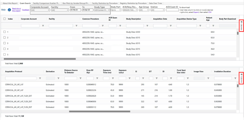
Using the scrollbar at the bottom of the page, scroll to the right to view the dose index values for each event including Exposure Index (EI), Target Exposure Index (EIT), Deviation Index (DI), and Kerma Area Product (KAP).
You can add or remove columns from the table by clicking on “Columns” in the sidebar (on the right) and selecting or deselecting specific column headers.
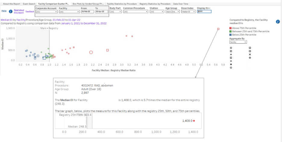
Facility Comparison Scatter Plot
This dashboard helps you identify potential problematic areas in your DR practice (specific facility, procedure, and age group). It does so by comparing facility median values with the registry interquartile range (25th and 75th percentiles).
In the scatter plot (see example below), there is one mark for each combination of facility, procedure, and age group. The value on y-axis is the facility median for that combination. The value on the x-axis is the ratio of the facility median to the registry median.
The size of the mark is determined by the number of events in that combination. Each shape denotes a different facility. The color indicates how the facility median compares to the registry interquartile range. Red marks represent combinations where facility median exceeds registry 75th percentile. Blue marks represent combinations where facility median is below registry 25th percentile. Both red and blue marks suggest potential problematic areas needing investigation. Use Display >= N to limit the scatter plot to show only marks with a minimum number of events.
Box Plots by Vendor/Group/Procedure
This dashboard displays box-and-whisker plots of individual event data by procedure, dose index, age group, device type, and DR station. By reviewing event-level data, one can identify outlier cases.
In the example below, a chest x-ray exam acquired using a fixed device has an extremely large EI of over 4,500. Using the study date/time and patient age in the information box, it would be possible to trace back to the original study in PACS to examine the root cause of the large EI. The box-and-whisker plot also provides information about data distribution. In this example, the target EI values expand a wide range, the reason for which should be understood.
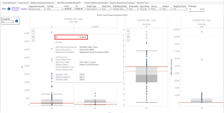
Another unique feature of this dashboard is the “Group By” function on the left side of the screen. It allows you to make side-by-side comparisons across different DR manufacturers at your institution and across user-defined station groups.

In the example above, by grouping the data by vendor, we can see that Vendor B is the major contributor to the large EI values. As such, quality improvement work may start with this vendor.
Facility Statistics by Procedure
This dashboard tabulates dose index statistics for the selected facilities by procedure, age group, and DR manufacturer in a download-friendly format. Data are limited to studies mapped to an ACR Common ID procedure and having EI>=0.

Registry Statistics by Procedure
This dashboard displays all registry statistics by procedure and age group in a download-friendly format.
Data are limited to combinations of procedure and age group, for which there are sufficient data for comparisons. For all measures except DI Standard Deviation Weighted by Station (Wgt DI Std), sufficient data is defined as having at least five facilities with 20 events each. For Wgt DI Std, there must be at least five facilities with at least one station that has at least 20 events.

Data Over Time
The Data Over Time dashboard displays event-level dose index value (y-axis) by study date (x-axis) and can help identify outliers and unusual patterns across time by procedure, age group or DR station. Only one measure is displayed at a time, as determined by the dose index filter. You can also home in on facility performance by the specific station.
